TL;DR
Key takeaways for writing high-signal UI/UX proposals on Upwork:
- Open with two specifics from the brief to show relevance fast.
- Offer a tiny paid milestone with clear “Done = …” criteria.
- Keep your opener under 220 words for phone readability.
- Attach one artifact + one result instead of portfolio dumps.
- Give buyers a choice (quick call or async plan) to lower friction.
- Use the micro-milestone library tailored to SaaS, mobile, ecommerce, etc.
- Show proof with Loom clips, Figma links, or test snippets.
- Standardize your process with templates, QA checks, and metrics.
- Avoid generic intros, unclear scope, or over-scoping promises.
- Refine weekly: review replies, update wording, and repeat.
Follow these habits and your proposals will stand out as specific, low-risk, and easy to accept.
Clients skim on phones. Lead your upwork designer cover letter with two specifics from the brief, propose a tiny paid first milestone with clear acceptance criteria, attach one relevant artifact, and offer a simple next step. This playbook gives you a reusable upwork ui ux proposal template and lane-specific variants (SaaS, mobile, ecommerce, systems, research) so your design proposal upwork messages feel precise, low-risk, and easy to accept.
How design buyers actually read proposals
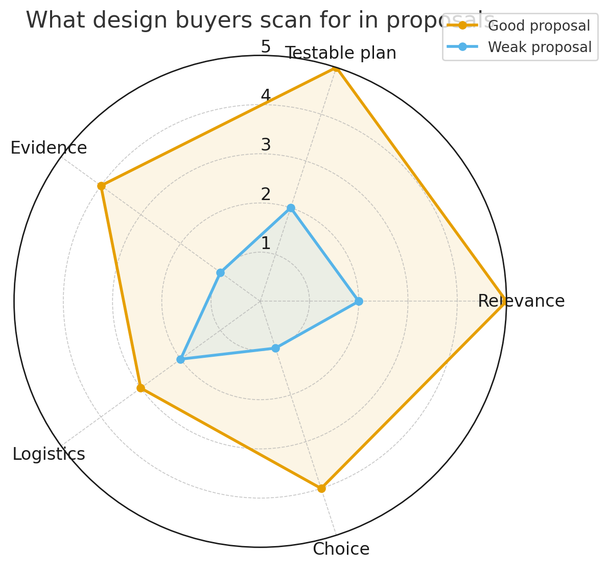
Design clients open dozens of bids. They’re not hunting for your life story—they want to see:
- Relevance in line 1–2 (problem, audience, platform).
- A small, testable plan they can say yes to this week.
- Evidence (one result + one artifact) tied to their context.
- Logistics (availability, overlap, tools: Figma, FigJam, Maze, GA4, Hotjar, etc.).
- A choice (10-minute call vs async outline) to make replying easy.
Everything below is engineered to hit those five needs in ~200 words.
The Core Upwork UI/UX Proposal Template (copy + personalize)
Use this skeleton as your default upwork ui ux proposal template. Replace {{braces}} with specifics from the post.
Subject: Practical plan for {{product/page}} — decision-ready in {{timeframe}}
Opener (2 specifics): “Two details stood out: {{audience or KPI}} and {{platform/constraint}}. Here’s a low-risk first milestone to de-risk your design.”
Micro-plan (3 bullets):
- Align on goals, users, and Done = {{acceptance_criteria}}; set access (Figma/analytics).
- Produce {{artifact}} (e.g., user flow + mid-fi prototype) covering {{scenarios}}.
- Validate with {{test method}} and ship a 1-page decision memo.
Proof (1 item): “Recent work: {{result}} for a {{industry}} product (60-sec Loom / Figma file).”
Logistics: “I’m in {{timezone}} with {{overlap}} overlap; tools: {{your stack}}.”
CTA: “Prefer a 10-minute fit call today, or I can send a 2-slide plan in a few hours—your pick.”
This is your reusable “spine.” All the variants later simply swap the middle to fit the lane.
Grow Your Upwork Sales with Automation
Discover how GigRadar helps you send better proposals, get more replies, and win clients faster — no manual work needed.
Book a DemoMicro-milestone library (useful “Done = …” lines for design)
Buyers love testable steps. Grab these acceptance-criteria snippets and tailor:
- SaaS dashboard: “Done = interactive mid-fi covering {{3 core flows}} with success paths + 1 error path; usability test (n=5 unmoderated) shows ≥80% task success.”
- Mobile app onboarding (iOS/Android): “Done = 5-screen mid-fi prototype with gesture patterns; 3 blockers resolved from current build; App Store/Play guidelines checked.”
- Marketing site hero + above-the-fold: “Done = 3 hero variants with copy options; time-to-clarity ≤5s in 5-user first-impression test; CLS safe layout spec.”
- Ecommerce PDP: “Done = size/variant flow + image gallery spec; INP-aware interactions; add-to-cart clarity validated in 5-user test with ≥4/5 confidence on ‘What happens if…?’ question.”
- Design system tokens: “Done = type/spacing/color tokens (light/dark) documented; 6 core components at v1 with usage notes + accessibility annotations.”
- UX audit: “Done = 10-page heuristic review (Nielsen/Norman) + prioritized fixes (quick wins vs investments) mapped to KPIs.”
- Checkout friction fix: “Done = map of blockers from analytics/session replays + 2 prototype variants; recommend next sprint with expected impact.”
- UX writing/microcopy pass: “Done = revised microcopy for {{X}} screens, voice/grammar rules, and before/after comps.”
Put Done = ... in the client’s words and you reduce scope fights later.
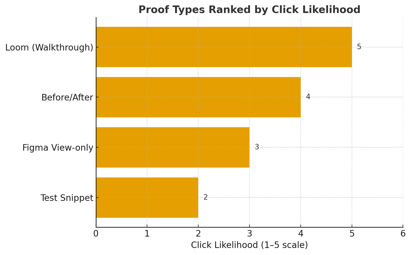
What counts as “proof” for design (and gets clicks)
Swap portfolio dumps for one sharp artifact:
- Loom (60–90s): A fast walkthrough of a similar flow; add 2 bullets on outcome.
- Figma view-only: Link to a specific page with marked annotations (never the whole file soup).
- Before/after: Side-by-side of a UI change with a line on the result (e.g., higher completion, lower time on task).
- Test snippet: Screenshot of Maze/Useberry results (task success, SUS) with one takeaway.
One artifact + one result beats five disconnected links every time in a design proposal upwork message.
Real proof always beats generic portfolios. See how a UX/UI design agency applied this exact approach and generated $50K on Upwork with GigRadar: Read the case study
Sub-category variants (paste-ready middles)
Start from the core template and swap the plan, proof, and “Done = …”.
1) SaaS analytics dashboard
- Plan: user roles → key queries → card system; mid-fi with 2 chart types; empties/loading/error states.
- Proof: “Reduced cognitive load for B2B dashboard; task time down noticeably in tests (Loom).”
- Done = mid-fi for 3 core flows; 5-user test ≥80% success.
2) Mobile onboarding + activation
- Plan: map first-run → permissions → value moment; 2 concepts (progressive vs explicit).
- Proof: “Activation rate lifted after streamlined permissions; clip attached.”
- Done = 5-screen prototype; Apple/Google HIG compliance check.
3) Marketing page redesign (above the fold)
- Plan: message hierarchy → hero variants → responsive comp spec.
- Proof: “Scroll depth improved; bounce lowered post-hero refactor.”
- Done = 3 hero variants; first-impression test (n=5) clarity ≤5s.
4) Ecommerce PDP UX & CRO
- Plan: info priority (benefits, reviews, sizing) → image gallery → add-to-cart path clarity.
- Proof: “Raised add-to-cart rate on similar catalog; visual before/after included.”
- Done = prototype with size/variant flow + gallery spec; test shows comprehension.
5) Design system (tokens + components)
- Plan: audit current UI → token model (type/spacing/color) → 6 components with guidelines.
- Proof: “Shipped v1 system; handoff friction dropped across squads.”
- Done = tokens in Figma styles + docs; components with accessibility notes.
6) UX audit & prioritization
- Plan: heuristics + analytics + replay sample; priority map; 30/60/90 roadmap.
- Proof: “Audit → sprint plan led to measurable lift; one-pager attached.”
- Done = 10-page PDF + table of issues/owners/impact.
7) UX research sprint (lightweight)
- Plan: 3 research questions → 2 prototype variants → 5 remote tests.
- Proof: “Copy/flow decision backed by quotes + task outcomes.”
- Done = protocol, recording links, and decision memo.
8) UX writing & microcopy
- Plan: tone rules → error/empty states → conversion-critical lines.
- Proof: “Form completion rose after microcopy pass; before/after screenshot.”
- Done = new strings + guidelines in shared doc.
These variants keep your upwork designer cover letter category-native and credibility-dense.
| Sub-category | Plan | Proof | Done = … |
|---|---|---|---|
| SaaS analytics dashboard | User roles → key queries → card system; mid-fi with 2 chart types | Reduced cognitive load for B2B dashboard; task time down noticeably (Loom) | Mid-fi for 3 flows; 5-user test ≥80% success |
| Mobile onboarding + activation | Map first-run → permissions → value moment; 2 concepts | Activation rate lifted after streamlined permissions; clip attached | 5-screen prototype; Apple/Google HIG compliance |
| Marketing page redesign | Message hierarchy → hero variants → responsive comp spec | Scroll depth improved; bounce lowered post-hero refactor | 3 hero variants; clarity ≤5s in test |
| Ecommerce PDP UX & CRO | Info priority → gallery → add-to-cart clarity | Raised add-to-cart rate on similar catalog; before/after included | Prototype with variant flow + gallery spec; test shows comprehension |
| Design system | Audit UI → token model → 6 components with guidelines | Shipped v1 system; handoff friction dropped across squads | Tokens in Figma styles + docs; components with accessibility notes |
| UX audit & prioritization | Heuristics + analytics + replay sample; priority map | Audit → sprint plan led to measurable lift; one-pager attached | 10-page PDF + table of issues/owners/impact |
| UX research sprint | 3 research questions → 2 prototypes → 5 remote tests | Decision backed by quotes + task outcomes | Protocol, recordings, decision memo |
| UX writing & microcopy | Tone rules → error/empty states → conversion lines | Form completion rose after microcopy pass; before/after screenshot | New strings + guidelines in shared doc |
The “Upwork designer cover letter”: tone, length, and flow
Keep it phone-length. Use this arc:
- Two specifics from the brief.
- Micro-milestone with “Done = …” in their words.
- One proof (result + artifact).
- Logistics (tools/time zone).
- Choice-based CTA (call vs async).
Example (SaaS): “Two details stood out: you’re targeting product managers and want a decisionable dashboard on desktop. I’d start with a mid-fi covering usage, onboarding, and retention cohorts. Done = those 3 flows in Figma and a 5-user test showing ≥80% task success.
Recent work: simplified a metrics view for a B2B tool (60-sec Loom). I’m CET with 3–4 hours overlap; tools: Figma, FigJam, Maze. Prefer a 10-minute fit call, or I can send a 2-slide plan today—your pick.”
Pricing & scoping that reduce buyer anxiety
Don’t lead with a big number in your opener. Share options after the hook:
- A) Discovery micro-sprint (fixed): align, prototype slice, decision memo.
- B) Implementation milestone (time-boxed): build the agreed slice + handoff.
- C) Phase plan (range): full scope after A/B confirm assumptions.
Options signal maturity and let clients choose speed vs breadth. Agencies can standardize A/B across all agency web dev upwork proposals and design bids alike.
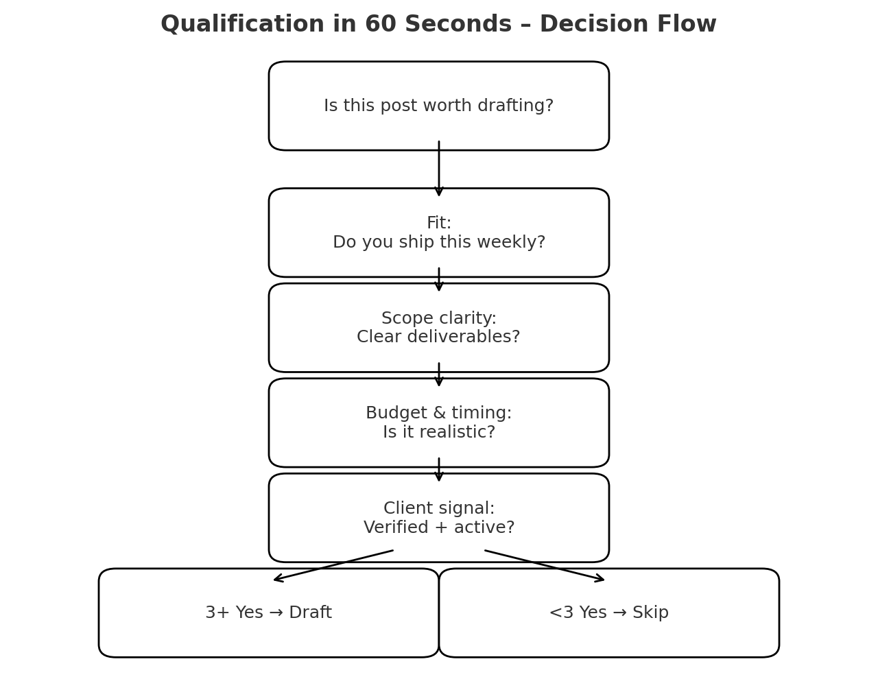
Qualification in 60 seconds (so you only write to fit)
Before drafting a design proposal upwork message, run this pass:
- Fit: Same audience/platform you ship weekly?
- Scope clarity: Deliverables vs wish list? Red flags like “free sample” or policy-dodging asks?
- Budget/timing: Plausible for the ask and your calendar?
- Client signal: Payment verified, past hires, recent activity, reasonable tone?
Three yeses → draft. Fewer → skip or request clarification. Focus is half the win.
Spotting red flags early saves hours and keeps your pipeline safe. We broke down the most common Upwork scams and how to avoid them here: Read the article
Accessibility & handoff (quiet signals buyers notice)
Add one line that shows you design responsibly:
- A11y: color contrast checks, focus order, error states with instructions.
- Handoff: named layers/variants, usage notes, redlines or tokens, simple change log.
- Analytics: where to instrument for decisions (events or scroll depth).
These details raise trust and improve your upwork job success downstream.
Agency section: make proposals a system (not heroics)
Turn the template into a repeatable engine:
- Lanes: SaaS, mobile, marketing, ecommerce, system, research.
- Saved searches: per lane with negative keywords (e.g., -homework, -AI-detector).
- Triage: PM/VA qualifies posts with the 60-second script; only P1s get drafted now.
- Template vault: openers, “Done = …” library, artifacts per lane.
- QA gate: no send without two specifics, one micro-milestone, one proof, and a choice-based CTA.
- Metrics: replies, interviews, hires per lane; prune low performers monthly.
This is how agencies scale proposal quality without bottlenecking on one senior designer.
Common mistakes (and the fast fix)
- Generic intros: If your opener fits any job, it fits no job. Fix: two specifics in line 1.
- No acceptance criteria: “We’ll start” isn’t a plan. Fix: Done = … in client language.
- Portfolio dumps: Ten links repel. Fix: one artifact + one result.
- Over-scoping: Don’t promise the whole product; promise the first slice. Fix: micro-milestone A/B/C.
- Ignoring a11y/handoff: Fix: add one line on contrast, states, and tidy Figma.
Proposal QA checklist (run before you hit send)
- Two explicit details from the job appear in line 1–2.
- Micro-milestone includes Done = … in the client’s words.
- One proof with a clickable artifact (Loom/Figma/screenshot).
- Tools/time-zone/overlap stated.
- CTA offers a choice (call vs async plan).
- Length is phone-friendly (~150–220 words).
If any box is unchecked, it’s not ready.
10 opener lines you can steal (and then personalize)
- “Because your KPI is activation, let’s prototype the first-run + permissions path and test it this week.”
- “Your B2B dashboard needs decisionable defaults; I’ll map queries → cards → drill-downs and validate with 5 users.”
- “The PDP confusion you described is solvable with variant clarity + gallery behavior—here’s a safe first slice.”
- “You’re on Figma with light/dark themes—let’s lock tokens and 6 core components for predictable velocity.”
- “If INP spikes, we’ll shape interactions that feel instant and spec the UI to avoid long tasks.”
- “Since your audience is non-technical, I’ll prioritize copy + primary actions and validate comprehension in minutes.”
- “Because you’re migrating marketing → product pages, I’ll map message hierarchy and deliver 3 hero variants for a fast decision.”
- “You already have GA4/Hotjar—perfect. I’ll pull evidence into a 10-item audit with priorities.”
- “We can tighten checkout by removing surprise states and clarifying errors; I’ll prototype two options.”
- “If IA is the blocker, I’ll deliver a site map + task-based flows you can approve before UI details.”
Swap your details in and ship.
A one-week improvement plan (that compounds)
- Day 1: Draft your “Done = …” lines for your top two lanes.
- Day 2: Record one 60–90s Loom per lane showing a similar flow.
- Day 3: Write three opener variants (plan-first, proof-first, risk-led).
- Day 4: Create a one-page decision memo template for handoffs.
- Day 5: Clean saved searches; add 3–5 negative keywords per lane.
- Day 6: Send two proposals using the template; attach exactly one artifact.
- Day 7: Review replies; refine “Done = …” wording to mirror buyer language.
Repeat weekly. Your response rate will rise without adding hours.

Final thoughts
Great proposals aren’t long—they’re specific. Anchor your upwork designer cover letter in the client’s audience and platform, propose a micro-milestone with “Done = …” in their words, and back it with one relevant artifact. Wrap that into a simple, reusable upwork ui ux proposal template, and your design proposal upwork messages will feel like an obvious “yes.” Keep the promises small and testable, communicate clearly, and let consistent delivery turn more proposals into interviews—and interviews into shipped, loved product experiences.
For sister-category playbooks: see the winning Upwork data & AI proposals guide and the winning SEO & content proposals guide — same skeleton, tuned to each buyer.
Grow Your Upwork Sales with Automation
Discover how GigRadar helps you send better proposals, get more replies, and win clients faster — no manual work needed.
Book a Demo