
Ideal Customer Profile Template: Free 2-Axis Scorecard. A two-minute walkthrough of the citation trail, the reply-rate inversion, and the two-axis scorecard. Watch on YouTube
TL;DR
- Six ranking ideal customer profile template articles cite the same "68% higher win rates" figure. Follow the citations and the trail dead-ends at a 2019 vendor report on a domain that no longer resolves.
- Standard templates are built by describing closed-won accounts. That tells you who pays well. It cannot tell you who will answer, because you only kept the accounts that already answered.
- On Upwork the firmographics are public before you make contact, so this is measurable. Across 91,056 proposals, the attributes that signal a valuable client run backwards against reply rate.
- The mechanism is crowding, not client quality. Visible attractiveness draws competitors, and competition is a tax on response.
- A usable ICP carries two numbers per attribute: value and reachability. The scorecard below builds both, and exports to CSV.
Six of the pages ranking for "ideal customer profile template" cite the same number: companies with a strong ICP achieve 68% higher win rates.
Three different organisations get the credit. One page credits SiriusDecisions, another credits TOPO, a third credits Salesforce.
A fourth page skips the attribution entirely and just links out. So I followed the links instead, and four hops later it dead-ends.
Where the 68% actually comes from
1. HG Insights states it, and links the words "68% higher win rates" to…
2. SuperOffice, which says "research shows" and links to…
3. SalesIntel, which credits HubSpot and links to…
4. HubSpot's ABM statistics roundup, which links to…
5. A 2019 TOPO benchmark report hosted at resources.engagio.com, a domain that no longer resolves. Demandbase acquired Engagio in June 2020 and the report went with it.
The trail ends at a gated vendor benchmark from 2019 that you can no longer open. No visible methodology, no sample size, and no way to check any of it.
The metric also changes definition in transit. HubSpot and SalesIntel both say "account win rates"; by the SuperOffice hop the word "account" has quietly dropped and it reads as plain "win rates".
Those are not the same measurement, and the mutation happens two links from the top of Google. Apollo reports the same 68% as "account engagement", which is a third claim again.
That is the shape of the whole category. ICP advice is assembled from other ICP advice, and almost none of it is checked against a dataset that includes the accounts that never replied.
Every ideal customer profile template is built on the accounts that survived
The standard instruction is identical across every guide: pull your top 20 to 50 closed-won accounts, find the shared firmographics, write it down.
That method conditions on the outcome. You are fitting a targeting model on a sample where the answer is always yes.
The accounts that would have been excellent customers but never answered your first email are invisible in this analysis. They are also, by definition, the entire problem you are trying to solve.
It gets worse on the second pass. Your closed-won list is jointly determined by fit and by whichever accounts your current outreach happened to reach at all.
Each revision narrows the profile toward the channel you already have, you close more of that, and the ICP appears to validate itself.
That is not evidence. It is a feedback loop wearing a lab coat.
To be fair to the method: for lifetime value, expansion revenue, and churn drivers, analysing your best customers is the only valid approach available. Nobody else can tell you what a good customer looks like after they sign.
The failure is narrower than that. A description of who paid you is not a prediction of who will answer you, and the standard template silently uses the first as the second.
Build the scorecard: fit and reachability, scored separately
The fix is not a better attribute list. It is a second axis.

Score every account twice: once for how much it is worth if you win it, once for how likely it is to engage with you at all.
Drag the sliders below, read the verdict, export the row.
Free Interactive Tool
The Two-Axis ICP Scorecard
Score one account on value and on reachability. The verdict changes when the two disagree.
Account name
Value signals
What this account is worth if you win it.
5 / 10
5 / 10
5 / 10
Reachability signals
How likely they are to answer you at all.
5 / 10
5 / 10
5 / 10
Disqualifiers (any one caps the account)
Verdict
Balanced
Move the sliders to score an account.
Score 10 accounts, export each, and you have a real target list instead of a paragraph.
Upwork is the one place you can check whether any of this is true
In classic B2B outbound you cannot test an ICP against non-responders, because you never learn anything about the companies that ignored you.
Upwork inverts that. Client spend history, feedback score, payment verification, hiring history, and country all sit on the job post before anyone makes contact.
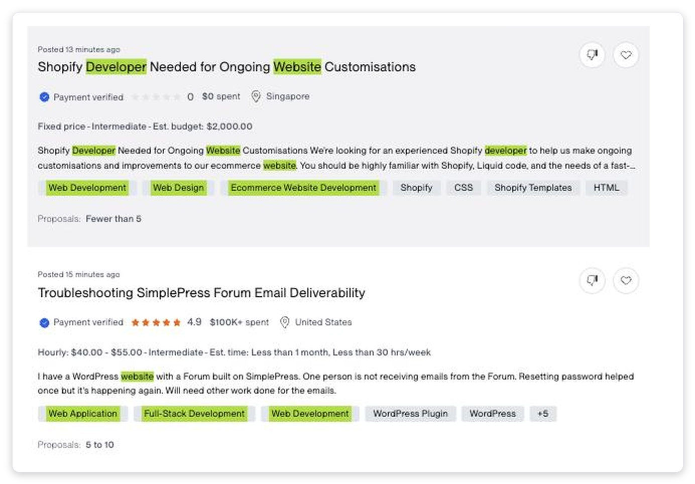
So the firmographic attributes in a standard ICP template are observable in advance, and every proposal is a logged attempt whether or not it got an answer. That gives you a denominator.
The attributes that signal a good client run backwards against reply rate
Here is what happens when you sort those proposals by the client's lifetime spend on the platform, which is the closest Upwork analogue to "company revenue" in a firmographic template.
| Client lifetime spend | Proposals (n) | Reply rate |
|---|---|---|
| $0 (new client) | 25,413 | 6.89% |
| $1 to $1k | 11,506 | 8.15% |
| $1k to $5k | 13,817 | 7.90% |
| $5k to $25k | 16,908 | 6.84% |
| $25k to $100k | 12,977 | 6.03% |
| $100k to $500k | 8,070 | 5.70% |
| $500k+ | 2,365 | 3.85% |
Source: GigRadar internal pipeline data, January to February 2026. Reply is defined as the client opening a chat or moving the proposal into a hiring room.
The highest-spending clients answer at less than half the rate of clients who have spent between one and a thousand dollars.
Feedback score points the same direction. Clients rated 4.8 and above reply at 6.5% across 49,135 proposals, while clients rated below 3.5 reply at roughly double that rate.
That low-rated cell is thin at n=351. Treat the direction as solid and the multiple as approximate.
The mechanism is crowding, not client virtue
The wrong conclusion here is "go bid on badly-reviewed clients." That reads the correlation as a statement about client character, which it is not.
Spend, rating, and company size are all confounded with one thing: how many other people are looking at the same opportunity. A well-funded client with a clean five-star history and a large budget can attract fifty to a hundred bids, and even an excellent proposal lands in a pile.
Visible quality is a proxy for crowding, and crowding is a tax on reply rate. Any attribute a prospect can be scored on publicly is an attribute your competitors are already sorting by.
We can check this from a completely different direction. GigRadar's own scanner assigns every job a match score, which is a trained model estimating how well a job fits a given agency.
If match quality drove response, the top-scoring decile should reply best. It replies worst.
| Scanner match-score decile | Reply rate | Reading |
|---|---|---|
| Bottom decile (0.00 to 0.38) | 8.19% | Thin competition |
| Middle deciles | 6.5% to 8.5% | Mixed |
| Top decile (0.83 to 0.93) | 5.18% | Everyone else found it too |
Source: GigRadar internal pipeline data, n = 59,339 proposals with full opportunity metadata.
Bottom-decile matches reply about 60% better than top-decile matches. A "perfect fit" job is perfect for everybody else running a similar filter, which is the whole explanation.
This is why narrowing a scanner to only the highest-scoring jobs usually reduces total replies rather than improving yield. Match score measures competition density at least as much as it measures deal quality.
The operators who work this out stop hunting for the best jobs and start hunting for the least-attended ones.
"Here is the trick for you. You need to check in the job search jobs that have less than five proposals. Meaning that you need to check what jobs were not applied on Upwork."
One of the instructors, GigRadar Agency Success course, "Not enough good jobs?"
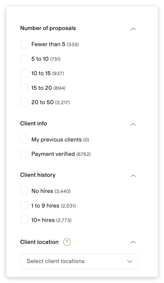
That is the reachability axis stated as a search query. Here is the full lesson:
From GigRadar's Agency Success Course, the "Not enough good jobs?" lesson on widening a search into under-fished niches.
Your six weighted attributes are not doing what you think
Almost every template ends with a scoring rubric. Translated to Upwork it reads: category match 25 points, budget band 20, client spend tier 20, payment verified 15, hiring history 10, retainer potential 10.
We ran a 30-feature logistic regression on 133,872 proposals to predict whether a client would reply. Cross-validated AUC came out at 0.585, which is a real signal and a modest one, explaining roughly 16% of the variance.
That AUC was measured on proposal and bid features, not on firmographics, so it is not a direct test of ICP rubrics. Treat it as the realistic ceiling for how well anything predicts engagement in this domain, with 133,872 rows behind it.
A rubric with six attributes, weights assigned in a workshop, fitted on twenty accounts, is not beating that. It produces a number that feels like 0.85 and behaves like 0.55.
The structural problem compounds the statistical one. Client spend tier, budget band, category maturity and team size all move together, so six attributes give you perhaps two or three independent dimensions of information.
"Account A scored 74, account B scored 68" is not a decision. It is rounding error with a spreadsheet around it.
The counterargument, which is a good one
The rubric's real job may not be prediction at all. Five people applying one written definition, with disagreements made explicit, is worth money even if the score has no predictive validity.
That is a coordination benefit, and it is real. So keep the attributes as written pass/fail gates and delete the weights and the numeric tiers.
| What the rubric is for | Weighted score | Pass/fail gates |
|---|---|---|
| Everyone applies one written definition | Yes | Yes |
| Disagreements surface and get audited | Yes | Yes |
| Ranks account A above account B reliably | No | Does not claim to |
| Implies precision the data cannot support | Yes | No |
You keep all of the coordination value and stop pretending the number ranks anything.
Disqualifiers are worth more than qualifiers
Exclusion requires you to be right about one thing. Ranking requires you to be right about the order, which the previous section says you are not.
The best positive band in the spend table beats baseline by about 1.2 percentage points. The bad bands sit much further out and hold up far more reliably.
That last pair is the detail no qualifier list ever captures. A client with one dead job post performs worse than a client who has never posted at all, because the first is a tire-kicker with evidence and the second is simply new.
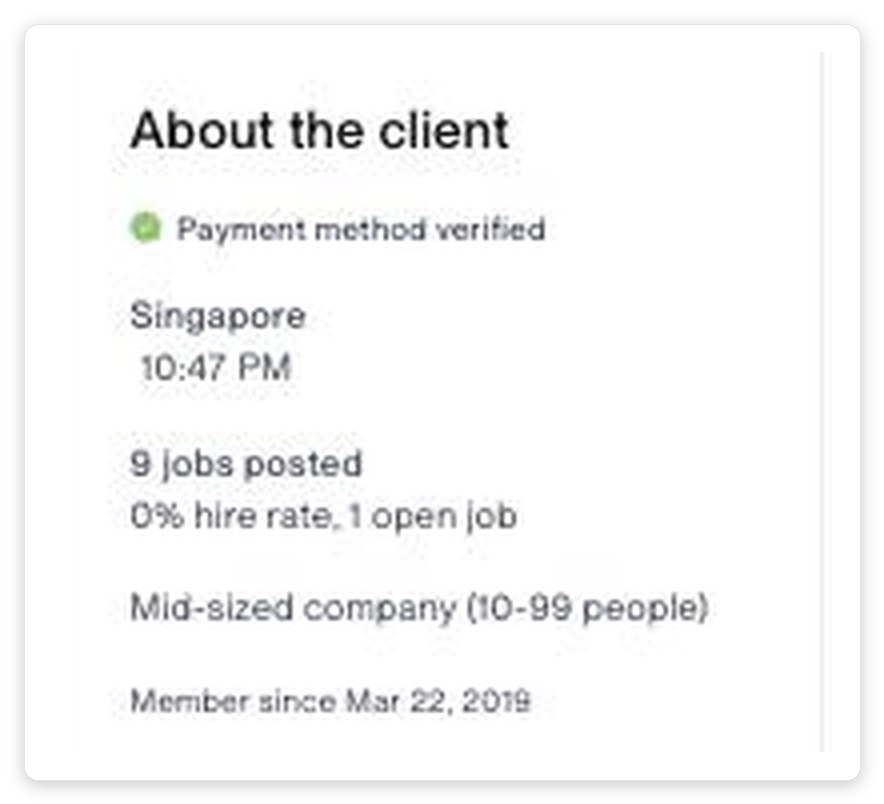
Payment and identity verification is the one attribute in the whole set that behaves the way conventional advice says it should. Upwork runs its own client identity verification process, and the resulting badge is a genuine screen rather than a popularity signal, which is exactly why it does not attract a crowd.
Disqualifiers tend to be binary observable facts with large stable effects. Qualifiers are graded judgments that drift between people and between quarters.
Where this advice stops being true
This depends entirely on pool size. On Upwork the pool of jobs is effectively unlimited, so aggressive exclusion costs almost nothing and every excluded bad target is a directly reallocated connect.
Against a named 400-account outbound territory, aggressive disqualification can leave a rep with nothing to work. Exclusion also creates false negatives you never see, which is the same survivorship failure running in the other direction.
Large pool (Upwork)
Thousands of live jobs, and connects are the binding constraint. Exclusion is nearly free, so lead with disqualifiers and let every skipped target reallocate a bid.
Finite territory (named outbound)
A fixed account list, and rep attention is the binding constraint. Aggressive exclusion can empty the queue, so qualifiers earn their keep here.
Use disqualifier-first when your pool is large and your bidding budget is the constraint. Use qualifiers when the accounts are finite and the constraint is attention per account.
The Upwork-specific version of that exclusion list is in the ICP red-flags breakdown.
The template, in six fields
Everything above collapses into a document short enough that people will actually reread it. Copy this, fill it in, and delete anything you cannot observe before making contact.
Field four is the one that does the work. Most ICP documents are mostly attributes you only discover after a conversation, which makes them a post-hoc description rather than a targeting filter.
Free for Upwork agencies
Point your ICP at the jobs nobody else found
GigRadar turns your profile into scanners that surface matching Upwork jobs continuously, scores each one, and shows you the reply data behind every segment you target. We will audit your current targeting and show you which filters are fishing a crowded pond.
Get Your Free Agency Audit →How to build this in an afternoon
The document is worthless without the pass that produces it. This is the sequence we walk agencies through, and it fits in about four hours.
Hour one: list the losses, not the wins
Export every proposal or outbound message from the last 90 days, including the ones that got nothing back.
The non-responders are the denominator. Without them you are doing the same broken analysis as everyone else.
Hour two: cut every attribute you cannot see in advance
Go through your current profile and strike anything that only becomes knowable on a call.
Budget authority, internal politics, and cultural fit are all real and none of them are filters.
Hour three: split the survivors into value and reachability
Put each surviving attribute in exactly one column. Most agencies discover their profile is entirely value and has no reachability column at all.
Score ten real accounts through the tool above and export them.
Hour four: turn the disqualifiers into a saved filter and enforce them for 30 days
Three is the limit. More than that and nobody remembers them under time pressure.
Track reply rate before and after. If it has not moved in 30 days, your disqualifiers were not binding on anything.
A profile that lives in a document is a profile nobody applies under time pressure. On Upwork the exclusion half compiles directly into the job search, which is the only reason it survives contact with a Monday morning.
One of the instructors in GigRadar's Agency Success course runs the market-research version of this live, pulling real rate distributions and job volumes before committing to a niche.
From GigRadar's Agency Success course, the "Can't find matching jobs?" lesson on sizing a niche before you commit to it.
What this changes about the way you target
The practical shift is small and the consequences are not. Stop asking "does this account look like our best customers" and start asking two questions in sequence.
Is it worth winning, and is anyone going to answer. When those two disagree, the standard template silently resolves the conflict in favour of the first one, which is how agencies end up spending their whole month bidding into the most contested corner of the market.
| Scorecard result | What it usually is | Action |
|---|---|---|
| High value, high reach | An underpriced niche you found early | Concentrate here |
| High value, low reach | The account everyone's ICP points at | Cap your spend |
| Low value, high reach | Easy replies that never become revenue | Use to test messaging |
| Low value, low reach | Where most untargeted volume lands | Disqualify |
The top-right quadrant is the only one worth building a pipeline around, and it is the one a single-axis template cannot locate. It also moves, which is why field six on the template is a review date rather than a suggestion.
For the downstream half, we covered proposal mechanics in qualifying Upwork jobs in 60 seconds and the definitional side in what actually makes a lead sales-qualified.
Per-segment reply and shortlist benchmarks you can borrow directly are in the category and budget benchmark tables. Geography gets its own pass in regional targeting, and once an account is live the account plan template takes over.
Everything here is downstream of one habit: keep the accounts that ignored you in the dataset. Almost nobody does, which is why almost every ICP template describes a past instead of predicting a future.