
🎬 Sales Report Template: The Only 5 KPIs You Need in 2026. A 2-minute walkthrough of the five numbers that predict whether you hit target, the 2026 benchmarks, and the per-channel fix. Watch on YouTube
TL;DR
- A sales report template should be a decision document, not a data dump. If it has 40 numbers, nobody reads it. Track five: win rate, pipeline coverage, quota attainment, sales velocity, and stage conversion.
- The benchmarks that matter in 2026: win rate 20–21% (top teams 30%+), pipeline coverage 3–4× quota, average B2B cycle ~84 days, and only ~27% of reps consistently hit quota.
- The mistake that quietly kills agency reports: slicing by rep instead of by channel. If Upwork, outbound, and referral all land in one blended number, you can't tell which channel to fund.
- Use the free health-check tool below to score your own five numbers against benchmarks, then copy the one-screen weekly template.
Most sales report templates are built to look thorough, not to be used. Forty rows, six tabs, a rainbow of conditional formatting, and on Monday everyone still asks the same question: are we going to hit the number or not?
A good sales report answers that question in one screen. The rest is appendix.
RevOps teams that report to leadership have converged on a hard rule: five KPIs, maximum. Add a sixth and readership drops, because the report stops being a decision and becomes a spreadsheet.
This is the version I'd hand an agency owner who runs a real pipeline: what to put in it, the exact formulas, and the 2026 benchmarks to grade each number against. There's a free tool to score your own numbers, plus a copy-paste weekly template at the end.
Score your sales report template before you build it
Put your own numbers in first. This scores the five KPIs that belong on every sales report and grades each against 2026 B2B benchmarks.
If three come back red, your problem isn't the template. It's the pipeline.
Free Interactive Tool
Sales Report Health Check
Enter last period's numbers. Get your five core KPIs, graded green / amber / red against benchmarks.
A sales report template is a decision, not a data dump
Here's the distinction that gets blurred everywhere: a dashboard is a live surface you glance at. A sales report is a periodic argument.
It takes a position ("we're tracking to 82% of target, driven by two channels, at risk on cycle length") and backs it with the minimum evidence needed to make a decision.
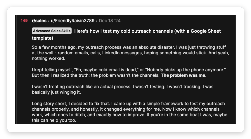
The best annual report format in the wild, from the RevOps community, opens with the answer and then justifies it. Lead with attainment, then the two drivers, then the two risks.
If a director reads only the first block, they should still be informed. Every report you build, weekly through quarterly, should inherit that shape.
Which is why the five-KPI ceiling exists. Five is the number a human actually reads before the meeting.
The consensus core, echoed across pipeline benchmark data and every serious reporting template, is:
Everything else (calls made, emails sent, demos booked) is an input. Inputs belong in the weekly activity view, not the report leadership reads.
Confusing the two is how agencies end up celebrating "300 proposals sent" in a month where revenue fell.
The five numbers that predict whether you hit the number
Each of these has a formula and a benchmark. The formula keeps the number honest; the benchmark tells you whether it's good.
Skip the benchmark and you're just reporting a number with no verdict attached.
1. Win rate
Won deals divided by all closed deals. The trap: measuring against all leads instead of qualified opportunities, which quietly halves the number and demoralises the team.
The 2026 benchmark is sobering. Average B2B win rate sits around 20–21%, down from 29% a year earlier per the Ebsta × Pavilion dataset.
Top performers clear 30%+, and post-proposal win rates climb to 31–50% per Norwest's 2024 benchmark. If your win rate on qualified deals is under 18%, that's your first red flag.
2. Pipeline coverage
Open pipeline value divided by the quota for the period. This is the single number that best predicts whether you'll hit target, and the one most agencies never calculate.
3. Quota attainment
Actual revenue closed against the target. Report it at the team level and per rep, but read it against reality: attainment is at multi-year lows.
Only about 27% of reps consistently hit quota, per Salesforce's State of Sales data, and average attainment hovers near 43% in RepVue's 2025 index. If your team is at 70%, that's not necessarily a fire; it's roughly the market, and context stops you from over-reacting.
4. Sales velocity
The one metric that combines the other four into a dollars-per-day figure. It answers "how fast is the machine actually turning pipeline into revenue?"
There's no universal benchmark, because velocity is a trend metric. Track it month over month.
If it's falling, dig into which input moved: fewer opps, lower win rate, smaller deals, or a longer cycle. For the mechanics of speeding it up, we went deep in the sales velocity breakdown.
5. Stage conversion
The percentage of deals that move from each stage to the next. This is your bottleneck detector: a stage where deal count grows but progression stalls is where revenue leaks, one of the core pipeline metrics worth watching.
Define your stages first. If they're fuzzy, see how to structure sales pipeline stages.
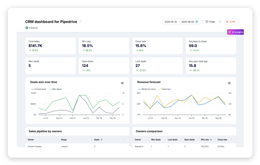
Match the sales report to who's reading it
One template does not serve a frontline manager and a board. The report changes by audience and cadence.
Reporting activity metrics monthly is useless; reporting win-loss analysis weekly is noise. Map it:
| Report type | Cadence | Who reads it | Headline metric |
|---|---|---|---|
| Activity report | Weekly | Front-line manager | Calls / meetings booked |
| Pipeline report | Weekly | Sales lead / owner | Weighted pipeline value |
| Conversion report | Bi-weekly | Sales ops | Stage-to-stage % |
| Forecast report | Monthly | Owner / finance | Expected revenue |
| Monthly dashboard | Monthly | Leadership | Revenue vs quota, win rate |
| Win/loss analysis | Quarterly | Strategy | Loss-reason breakdown |
For a small agency, three of these collapse into one weekly review and one monthly report. That's fine: the point isn't to produce six documents, it's to know which metric belongs at which altitude.
The sales pipeline template and forecast template cover the two heaviest of these in detail.
The mistake that quietly kills agency reports: slicing by rep, not by channel
This is the section most templates skip, and it's the one that matters most if you run an agency. Nearly every off-the-shelf sales report breaks the pipeline down by rep: who closed what, who's above quota, who's below.
That's the wrong first cut for an agency, because your new business doesn't come from one motion. It comes from Upwork, from outbound, and from referrals: three channels with completely different economics.
Blend them into one win-rate number and you've destroyed the only insight that would tell you where to put next quarter's money.
A 22% blended win rate can hide a 40% Upwork win rate and a 9% cold-outbound win rate. Reported blended, you'd "optimise" the wrong channel and starve the one that's actually working.
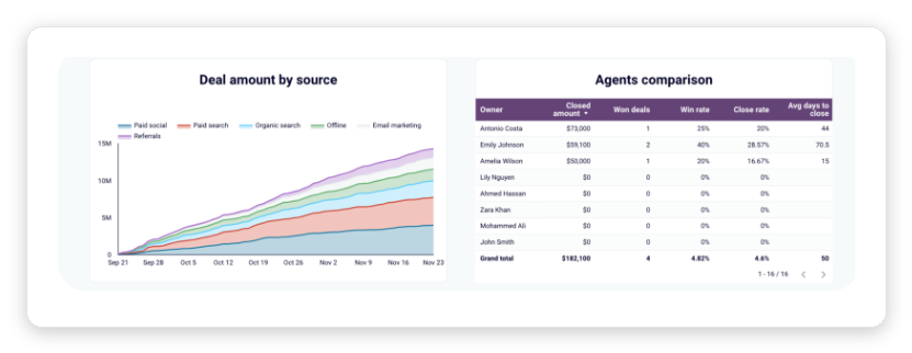
The fix is one extra column: source. Every deal carries its channel, and every core KPI gets reported per channel as well as blended.
Suddenly the report answers a real question: which acquisition channel returns the most revenue per dollar and per day of cycle?
For most agencies that run it seriously, Upwork is the cheapest channel to make measurable, because the pipeline is structured and the intent is high. The catch is that Upwork inflow is usually chaotic: proposals sent manually, no consistent record of what was bid on and when.
That's the gap GigRadar closes. Agencies invite our Upwork Business Manager through Upwork's official invitation flow, and proposals submit from our BM under our team's supervision.
Every submission becomes a tracked, timestamped row you can pull straight into the source column of your report. Your own Upwork account is never touched, and if Upwork reviews a submission, the review lands on our BM profile.
The result: Upwork stops being a black box and becomes a channel with a real win rate, a real cycle length, and a real cost. For the wider playbook, see our outbound sales strategy for agencies.
Copy this weekly agency sales report
Here's the one-screen weekly template. It fits the five-KPI rule, carries the source column, and opens with the answer.
Copy it into a sheet or your CRM and fill the blanks. This is the take-home.
WEEKLY SALES REPORT - Week of [DATE]

THE ANSWER
  Tracking to ____% of monthly target. Top driver: ______.
  Top risk: ______.

CORE FIVE (this week / last week)
  Win rate (qualified)   ____%  /  ____%   [benchmark 20-30%]
  Pipeline coverage      ____x  /  ____x   [benchmark 3-4x]
  Quota attainment (MTD) ____%  /  ____%
  Sales velocity         $____/day
  Stage conversion       ____%  (worst-converting stage: ______)

BY CHANNEL (win rate / avg deal / avg cycle)
  Upwork      ____%  /  $____  /  ____ days
  Outbound    ____%  /  $____  /  ____ days
  Referral    ____%  /  $____  /  ____ days

PIPELINE MOVEMENT
  New pipeline added     $______
  Deals slipped (pushed) ____   [keep under 20% of open]
  Deals stalled (>2x avg stage time)  ____

DECISIONS FOR NEXT WEEK
  1. ______
  2. ______
Notice what's not there: no "emails sent," no "activities logged," no vanity totals. Those live in the activity view your frontline manager checks daily.
The report leadership reads stays at five numbers plus the channel cut. Pair it with the right sales KPIs and you have a reporting system, not a spreadsheet graveyard.
Reporting cadence: what to send, and when
A template without a cadence rots. The report only drives behaviour if it lands on a predictable rhythm and each level sees the right altitude.
Here's the operating cadence that works for a lean agency sales team.
A live surface, not a document: calls, meetings booked, lead response time. Response time under 5 minutes is the one input that reliably predicts conversion.
Core five plus channel cut plus pipeline movement, opening the Monday review. Every number carries a week-over-week delta so the direction is visible at a glance.
Revenue vs quota, win rate trend, coverage, cycle length, and a forecast for the current period. This is what leadership and finance actually plan against.
Why did deals close and why did they die, grouped by loss reason and by channel. This is where you decide what to fund and what to cut next quarter.
Win rate is falling: report it in context
One reason reporting matters more in 2026 than it did in 2021: the baseline moved. Win rates dropped, cycles stretched, and attainment fell across the board.
A report that shows your numbers against those benchmarks stops your team from panicking over a market-wide shift. It also stops you from congratulating yourself on a number that's actually below par.
Free for Upwork agencies
Make Upwork a channel you can actually report on
Every proposal submitted, timestamped, and logged, so Upwork shows up in your sales report with a real win rate, cycle, and cost. We run it through our supervised Upwork Business Manager; your account is never touched.
Get Your Free Agency Audit →Sales report template FAQ
Five KPIs: win rate, pipeline coverage, quota attainment, sales velocity, and stage conversion, plus a one-line "answer" at the top stating whether you're tracking to target. Agencies should add a source/channel column so Upwork, outbound, and referral are reported separately, not blended.
Activity is a live daily view, not a sent report; the core five-KPI report goes weekly to open your pipeline review. A dashboard plus forecast goes monthly to leadership and finance, and win/loss analysis is quarterly.
3–4× your quota for the period is the standard benchmark, and below 2× you'll almost certainly miss. Above 4× with a low win rate signals a pipeline-quality problem rather than a quantity one.
Around 20–21% across qualified opportunities, with top performers above 30% and post-proposal win rates reaching 31–50%. Only about 27% of reps consistently hit quota, so grade attainment against that reality.
Not in the leadership report: calls, emails, and demos booked are inputs, so keep them in the weekly activity view your frontline manager checks. Mixing inputs into the outcome report is how teams celebrate effort in a month where revenue fell.